People look online for just about everything and that includes diagnostic imaging centers.
A 2012 study reported 72 percent of U.S. Internet users had gone online specifically for health-related information.
With the increase in people surfing the web, there is also an increase in competition. Along with that is a decrease in how much time viewers give your site to either impress or disappoint them.
It actually takes 0.05 seconds for the average site viewer to decide whether they like a website or not.
People make judgments about businesses very quickly from just a quick glance at their website. It’s clear that the visual appeal and usability of your site have a big impact on how long people stick around.
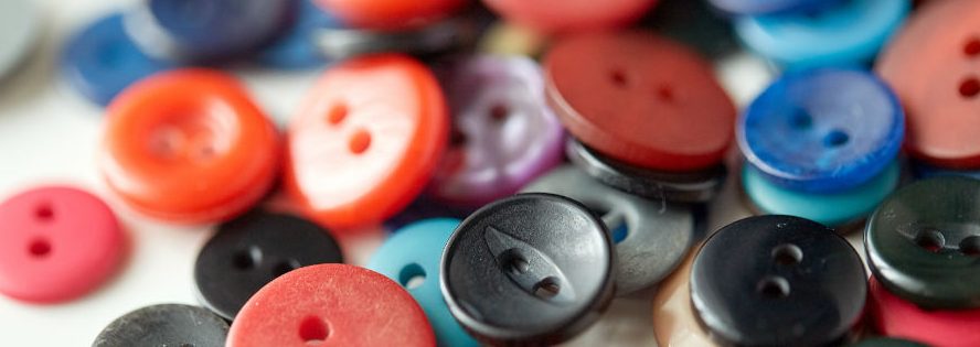
Well designed website buttons for radiology websites can get you more new patients.
Buttons help people quickly accomplish their goal without a lot of brainpower.
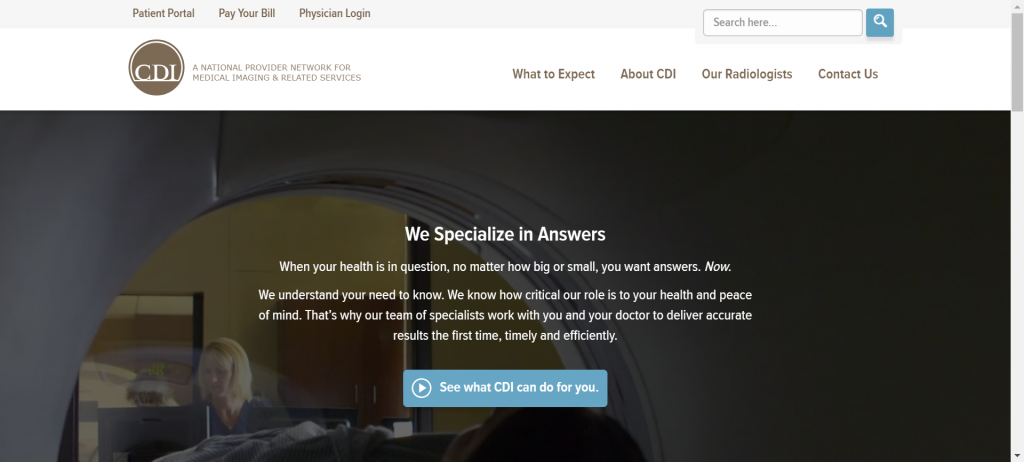
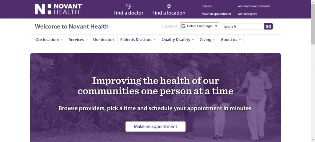
Take this site, for example. It’s well designed because it’s not cluttered. The main objective of this imaging center is to get you to watch their video. That is very clear with the button on the home page.
The color, positioning, and wording on your buttons all play a part in how likely people are to click on it.
Without clear buttons, your radiology website visitors need to sift through the navigation to find what they came for.
Determining the Goal
You have to first decide…
“What are people most commonly coming to my website to do?” and “What would I like people interested in my diagnostic center to do?”
We often hear answers like:
- Make an appointment
- Call the office
- Fill out our contact form
You may have more than one goal for your site visitors and that’s alright. If that’s the case, you’ll want to put them in order of priority.
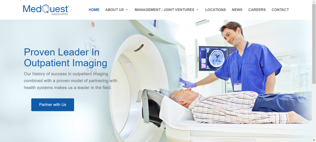
This Radiology Website Has a Different Goal
You can see right away that they are not catering directly to patients. This radiology group’s website has a goal of gaining new partnerships. Their well-placed button on the home page makes it easy for site visitors to see where to go for this.
Make your button stand out
In this example, we see buttons at the top of the page that are useful and even colorful, but they don’t really stand out because they compete with the rest of the page.
Make sure your buttons are big enough to see at a glance. Placing your button in an area that allows some empty space around it will help it stand out.
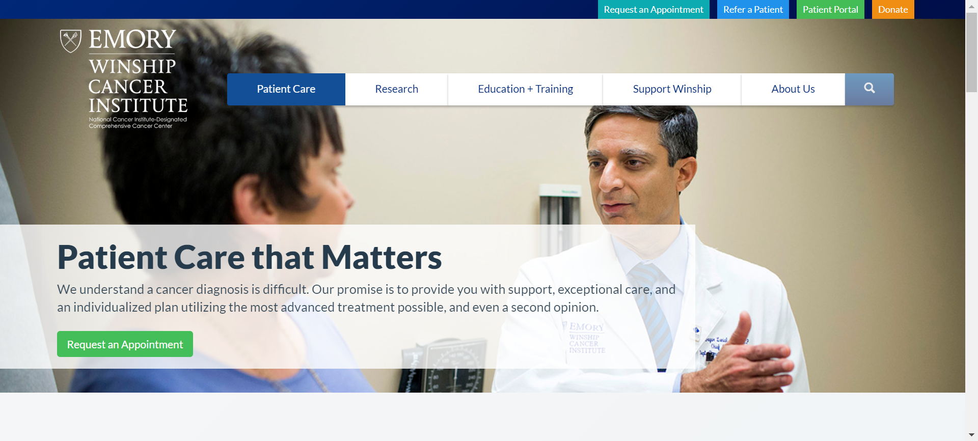
Here’s an example of a button that really stands out
Choosing a button color
The best color for your button depends on your diagnostics business, branding, and site layout. For many imaging centers, the best approach is to choose a vibrant color that stands out from the rest of the page but still matches a few smaller elements of the design to pull it all together visually.
This page is an example of a well-planned button color.

The Right Button Text
Now that you caught the eye of your audience, now you have to get them to click the button.
Try to make your text as specific as possible to let people know exactly what clicking will do for them.
Instead of saying “Contact Us” you might say “Make an Appointment” if that is aligned with your goal.
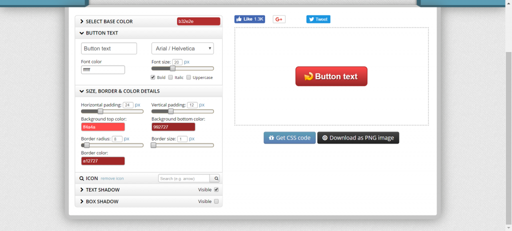
Button design tools
Though it’s helpful to be tech savvy, you don’t have to be a web developer to create a button. You can use a free tool like Buttonoptimizer.com to create your button, then download it as an image, or copy and paste the code to your site.
Remember, a well-designed button is just a small part of your website. All elements of a site need to work together visually and functionally in order to have an attractive and useful radiology site.
Do you need some help marketing your diagnostic imaging business?